GAME SPOT PALO
Logo


Poster

Shop Card

Post Card


Space
GAME SPOT PALO
THE PROTEAN LOGO
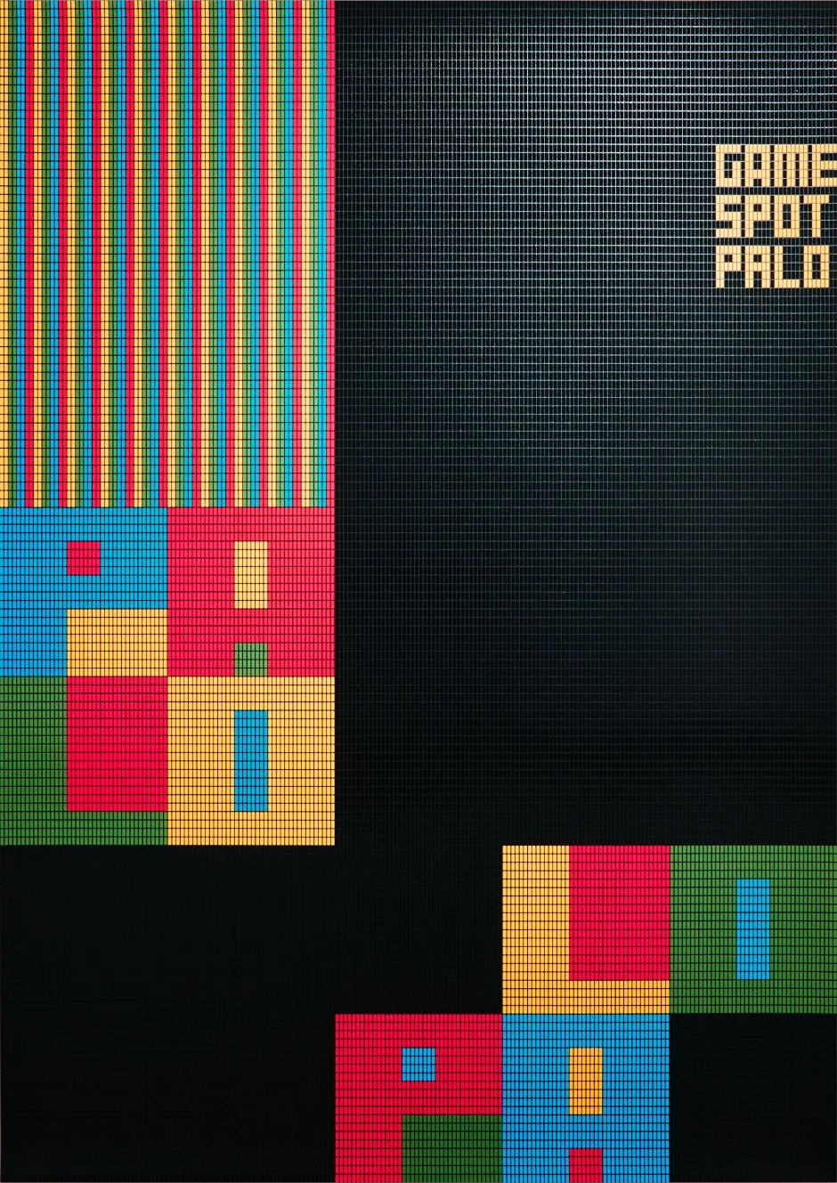
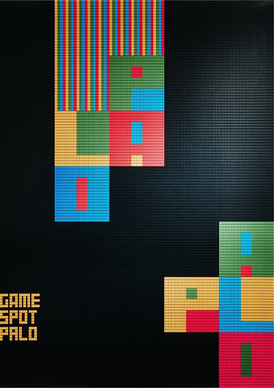
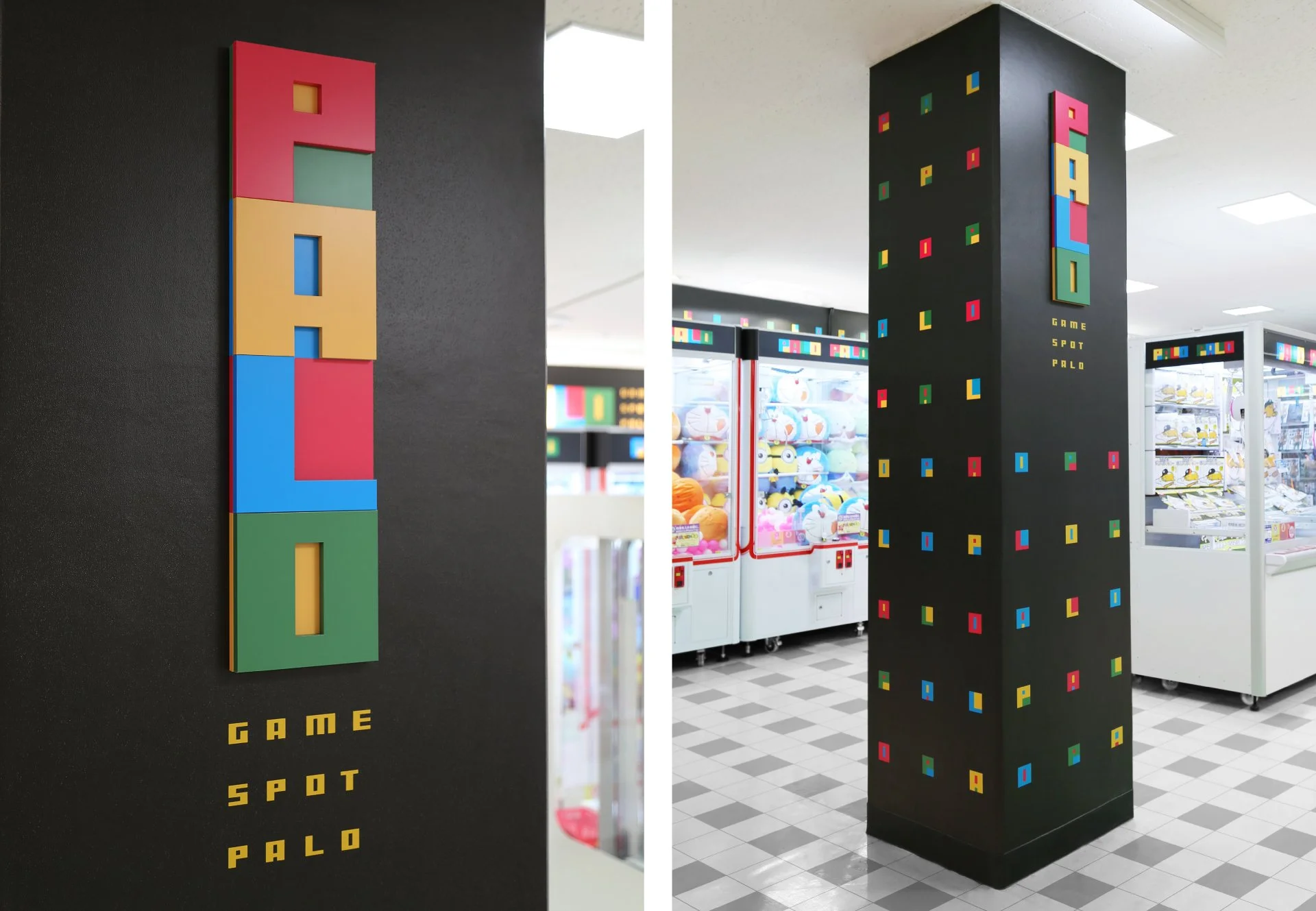
PALO is a chain of arcades. Our aim this time was to reinvigorate the old-fashioned, boring image of arcades on an economic budget, and to bring customers back to the arcades. We needed to redesign the whole space of all stores at once. The design modules are created as modeled after "pixels" (the minimum units of the video game graphics) with four colors. By combining these modules, we created the logo and used them for interior design in arcades. The logo can be remodeled freely according to its posting area. As the result, sales per store archived 113% at the most compared to the previous year.
自在に変形するロゴ
全国30店舗を展開するゲームセンターチェーン「パロ」のリブランディング。ビデオゲームのグラフィックの最小粒子である「ピクセル」を用いて、デザインモジュールをつくりました。このモジュールを組み合わせて、ロゴ、テキスト、ポスター、壁紙のテキスタイルパターンなどを生成し、それらで内装を構成。ロゴは、スペースの面積に合わせて、自由自在に変形することが可能なシステムになっています。
Client
AEON FANTASY Co., Ltd.
Team
Creative Director : Yoshinaka Ono
Art Director : Yoshinaka Ono
Copy Writer : Yoichi Ugaeri
Designer : Yoshinaka Ono
Designer : Midori Nozawa
Designer : Yuici Iwata
Printing Director : Emiko Kawashima
Planner : Mihoko Nisii
Planner : Yuichiro Kojima
Account Executive : Naoki Yamaguchi