Satofull
Logo

Business Card

Emvelope


Poster

Leaflet


Brochure

Entrance Sign


Pamphlet
Web
Satofull
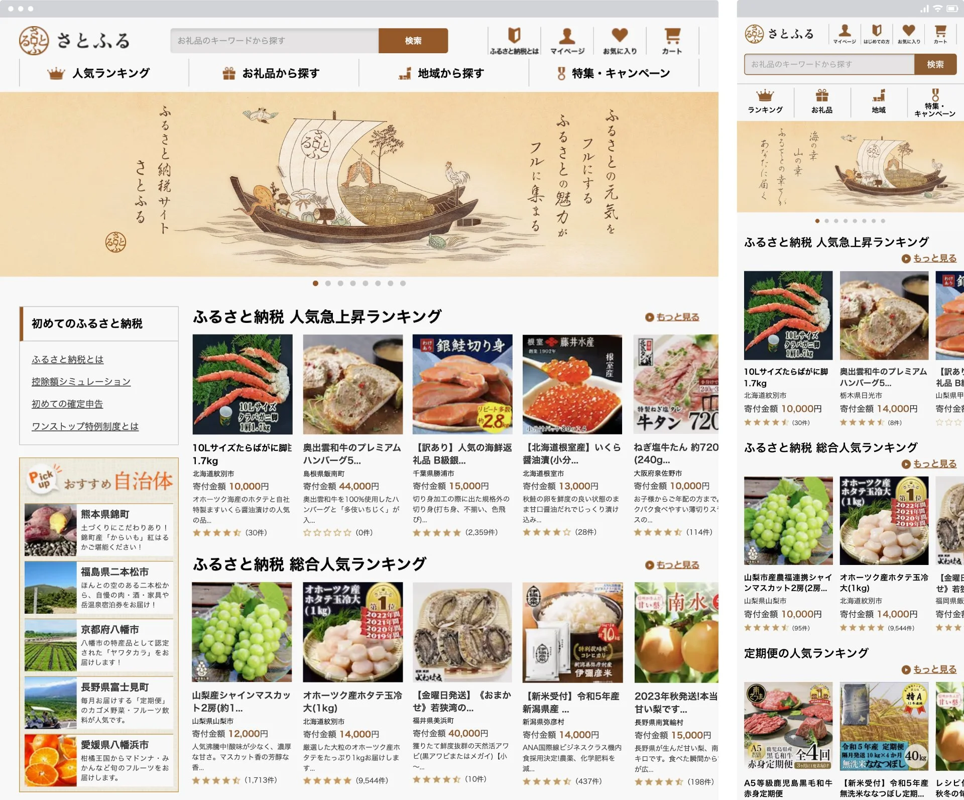
Hometown tax payment website
Gathering the full power of the hometown. The charm of the hometown is fully gathered. We named our company name and website "Satofull" from our desire to be such a website. We named our company name and website "Satofull". The logo was designed in the motif of a Wadokaichin coin. The word "Satofull" inside the coin can also be read as "Furusato" (hometown), expressing the fact that Satofull is a place that connects customers with their hometowns. The key visual depicts a treasure trove of specialties such as duck, chicken, sea bream, octopus, rice, vegetables, and sake. The key visual depicts duck, chicken, sea bream, octopus, rice, vegetables, sake, and other local specialties being sent home, using a treasure ship motif.
ふるさと納税サイト
ふるさとの力をフルにする。ふるさとの魅力がフルに集まる。そのようなサイトでありたい、という想いから 社名とサイト名を「さとふる」と命名。ロゴマークは和同開珎をモチーフにデザイン。貨幣の中に描かれている「さとふる」の文字は、「ふるさと」とも読め、「さとふる」が、お客さまと「ふるさと」をつなぐ場であることを表現。キービジュアルは鴨、鶏、鯛、蛸、米、野菜、酒、などの特産品が 送られてくる様子を宝船をモチーフに描いた。
Client
Satofull Co., Ltd.
Team
Creative Director : Yoshinaka Ono
Art Director : Yoshinaka Ono
Copy Writer : Dai Hirose
Designer : Yoshinaka Ono
Designer : Takanori Kimura
Designer : Tetsuya Utsumi
Designer : Ryusei Sakiyama
Illustrator : Shinji Kawamura
Producer : Akiko Hoshino
Strategic Planner : Nobuaki Nakamura
Strategic Planner : Jyunta Yoshikawa
Account Director : Shin Sumida
Account Director : Yoshikazu Furuta
Account Director : Wataru Saito