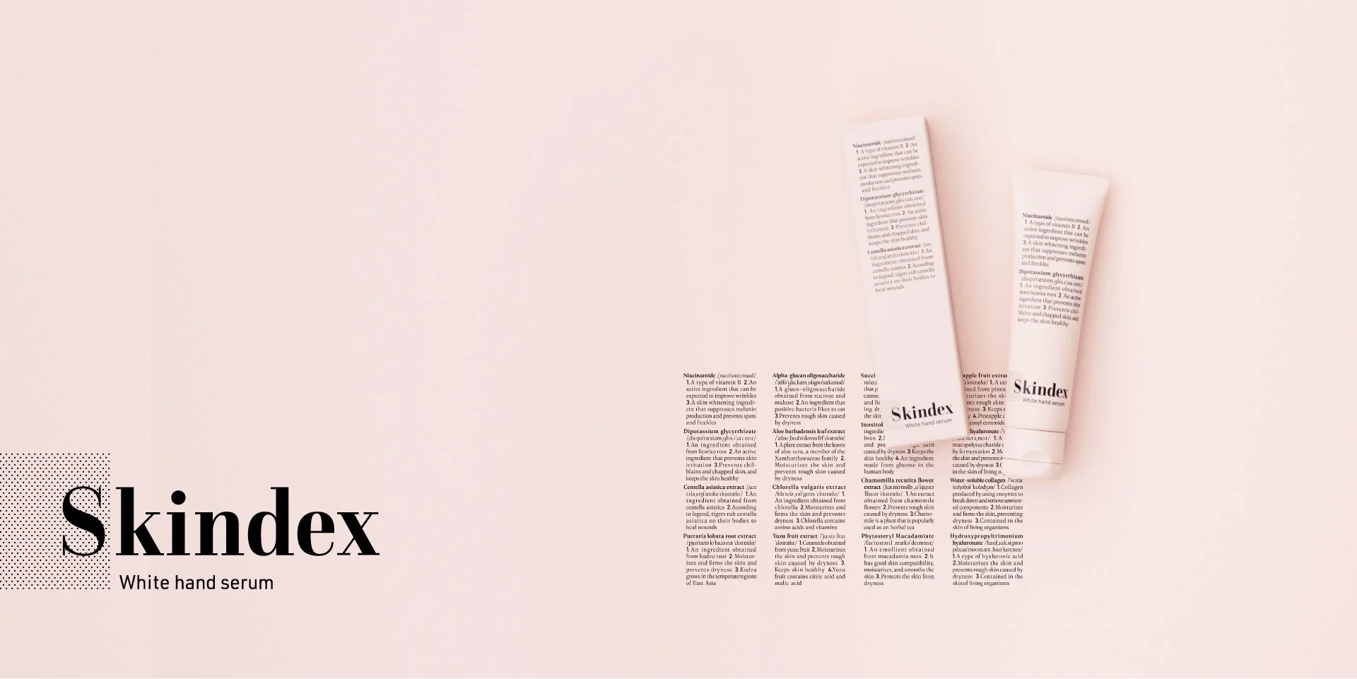
Skindex

Naming & Logo

Visual


Photo


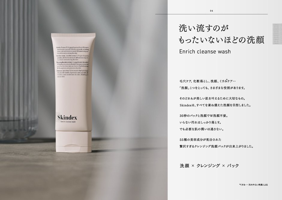


Pamphlet

Web


Skindex
Your Guide to Beauty
Branding for a skincare series "Skindex". We created the logo, packaging, leaflets, and website. Given the style of product creation, which incorporates a wide variety of the latest active ingredients, we decided that the best format was to focus on each active ingredient individually and carefully convey the information. The brand name "Skindex" was coined from the words "skin" and "index. The outer box and container were designed to look like a dictionary, listing the names of ingredients and their efficacy, so that users would be reminded of the efficacy of the product on a daily basis. The brand color is salmon pink, which symbolizes Skindex but has a less sweet, genderless tone.
美への手引き
スキンケアシリーズ「Skindex」のブランディング。ロゴ、パッケージ、リーフレット、WEB、とトータルで制作しました。最新の有効成分を種類豊富に採り入れる商品づくりのスタイルから、各有効成分を個別に取り上げて丁寧に伝えられるフォーマットが最適と判断。ブランド名は、SKIN[肌] + INDEX [索引] の造語でSkindexと命名。外箱や容器の表面には辞書のように成分名と効果効能を列挙することで、ユーザーが日々効果効能を再認識しながら使用できるデザインに。ブランドカラーは、スキンを象徴しつつ甘さを抑えたサーモンピンクでジェンダレスなトーンに仕上げました。
Client
Aminocells
Team
Creative Director : Yoshinaka Ono
Art Director : Yoshinaka Ono
Designer : Midori Utsumi
Designer : Momoka Atsumi
Designer : Koki Niijima