immue
Logo

Business Card

Key Visual


Web

Company Profile (PPT)
immue
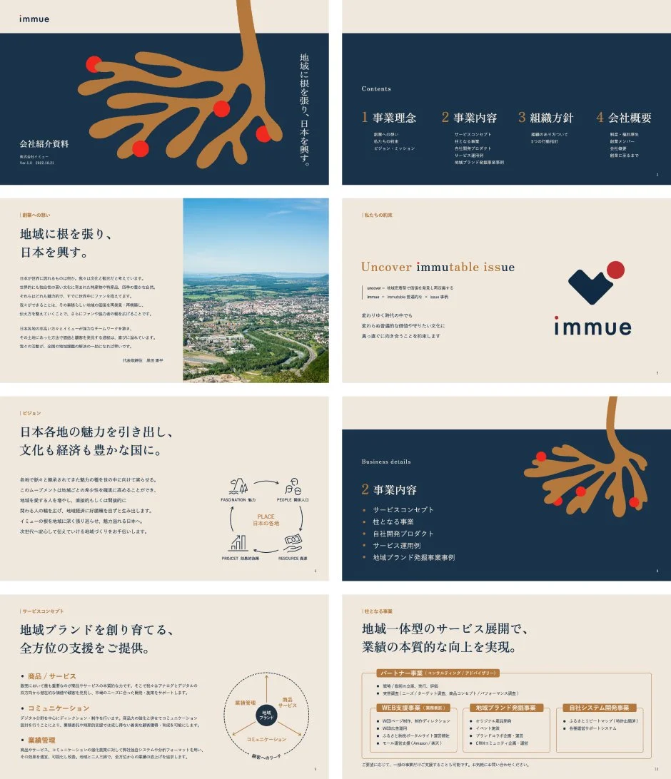
Rooted in Communities, Revitalizing Japan
Branding for “immue,” a company dedicated to producing regional brands. Working with municipalities and local businesses, the firm redefines and amplifies regional value by integrating initiatives from primary industries to distribution and PR. Its mission is to bridge urban and rural areas, unlocking new possibilities from local communities.
The corporate slogan, “Rooted in regions, revitalizing Japan,” encapsulated this philosophy. Key visuals portrayed roots firmly embedded in the ground and a red “fruit” linked to the logo, symbolizing the cultivation of Japan’s future through regional growth.
Core values and business scope were articulated and visualized with infographics, making the company’s personality and value proposition clear. By refining local resources and extending regional potential nationwide, immue expressed its commitment to nurturing the future of Japan.
地域に根を張り、日本を興す
地域ブランドのプロデュース企業「immue」のブランディング。地方自治体や地域事業者と連携し、地域の価値を再発見・再定義しながら、一次産業から販路開拓、地域PRまでを統合的に推進。都市と地方をつなぎ、地域から新たな可能性を生み出すことを使命としています。
コーポレートスローガン「地域に根を張り、日本を興す。」は、その事業姿勢を象徴。大地に張る「根」と、ロゴと連動した赤い「実り」を描いたキービジュアルによって、地域から日本の未来を育むという思想を視覚的に表現しました。
さらにMVVや事業内容を整理・言語化し、インフォグラフィックを用いて、企業のパーソナリティと提供価値を誰にでも理解しやすく伝達。地域資源を磨き上げ、地方の潜在力を全国へ広げ、未来の日本を育む意志をブランド全体で体現しています。
Client
immue Co., Ltd.
Creative Team
Creative Director : Yoshinaka Ono (inglewood)
Art Director : Yoshinaka Ono (inglewood)
Designer : Ryota Sugahara (SORA)
Copywriter : Mariko Naniwa (inglewood)
Designer : Momoka Atsumi (inglewood)