NIXER
Logo

Package

Magazine AD


Pamphlet


Photo

Web


NIXER
A Bold Puff.
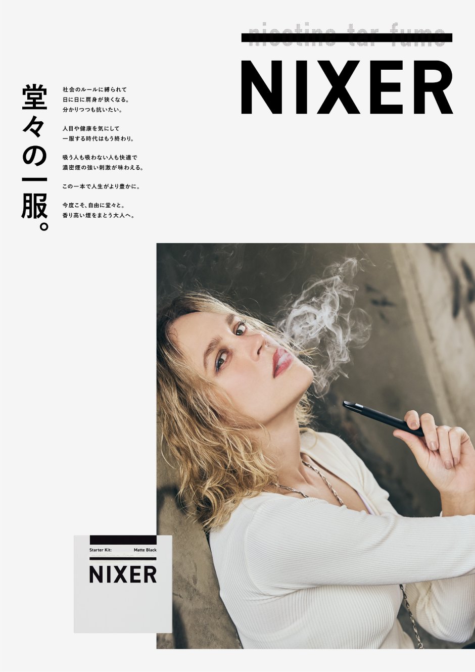
Branding for “NIXER,” a nicotine-free electronic cigarette. In an era where smoking habits are being redefined by stricter regulations, the brand proposed a new style for those who choose not to smoke. More than a substitute, it embodies both the appeal of a refined indulgence and the confidence to stand tall in society—dual qualities at the core of the brand.
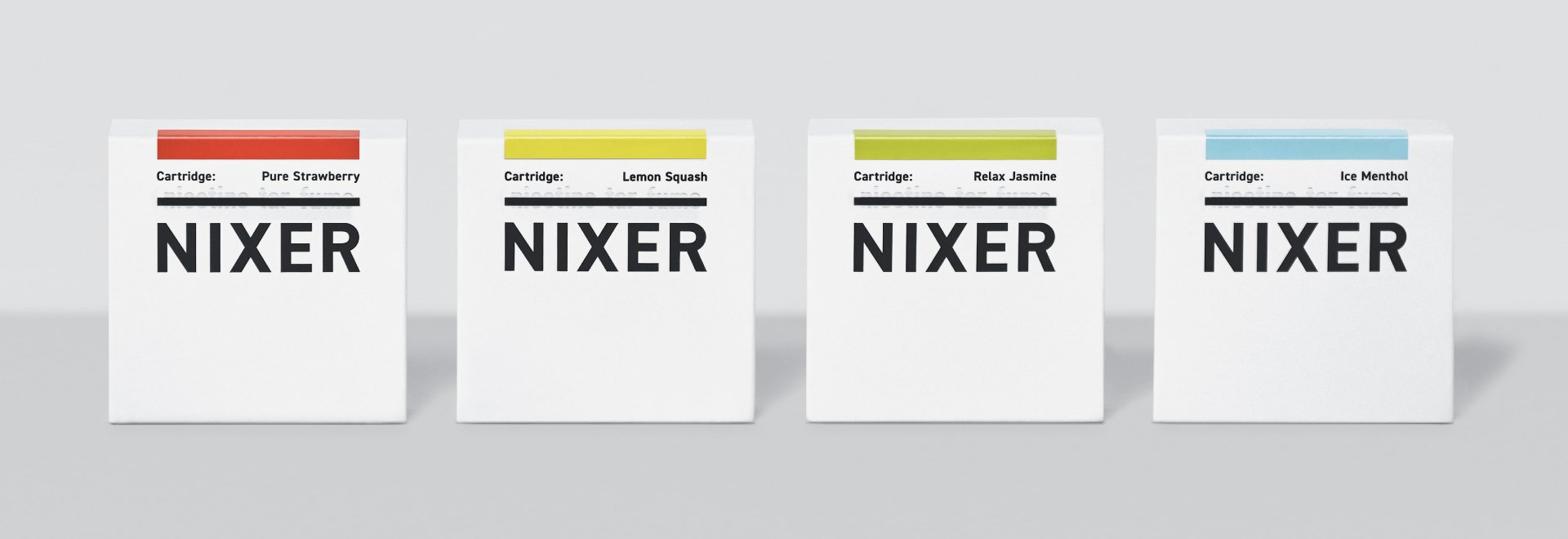
The name “NIXER” combines “NIX” (none) with “ER” (person). Its logo employed strikethrough lines to intuitively symbolize the absence of nicotine, tar, and fumes, presenting a quiet yet powerful image of a smoke-free lifestyle.
Packaging adopted a clean white base, appealing to younger users and women, while the solid logotype and bold color fields conveyed strength and familiarity for long-time smokers. This balance created a universal design language for a new kind of indulgence.
堂々の一服
ニコチンフリー電子タバコ「NIXER」のブランディング。禁煙・分煙が進み従来の喫煙習慣が問い直されるなか、「吸わないこと」を選ぶ人々に新しいスタイルを提示しました。単なる代替品ではなく、嗜好品としての魅力と社会に対して胸を張れる潔さ。その両立をブランドの核に据えています。
ブランド名は、NIX(無い)とER(人)を組み合わせた「NIXER/ニクサー」。ロゴは有害成分であるニコチンやタール、フュームを含まない特徴を“打ち消し線”で直感的に表現しました。「吸わないこと」を選ぶ時代にふさわしい、静かで力強い一服のスタイルを体現しています。
パッケージは白を基調にしたクリーンな印象で、若年層や女性にも受け入れやすいデザインに。一方でソリッドなロゴタイプや大胆な色面構成を組み合わせ、喫煙歴の長い壮年層にも自然に受け入れられる世界観を構築しました。
Client
MAXEL CO.,LTD
Creative Team
Creative Director : Yoshinaka Ono (inglewood)
Art Director : Yoshinaka Ono (inglewood)
Designer : Yusuke Takahashi (inglewood)
Designer : Shun Maeda (inglewood)
Photographer : Masatoshi Yamashiro
Photo Producer : Ryo Mitsuzuka (NODE)
Hair Make : Nami Takeoka